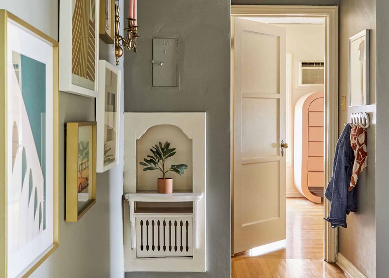
Check out the corridor outside. Despite its obvious usefulness, few individuals see it as an opportunity for artistic self-expression. But, just as with any other area in your home, a fresh coat of paint can have a dramatic effect on the ambiance of a hallway.
Nonetheless, many homeowners struggle while trying to choose which colour would be best for their hallways. When there is no preexisting furniture or abundant décor in a space, it might be difficult to narrow down your options and feel inspired. Because of this, deciding which choice to go with might be challenging.
How Should I Decide on a Color for My Hallway?
If you’re feeling a bit overwhelmed by the quantity of paint possibilities available to you and you don’t know where to start, take an objective look at the length of your hallway, the lighting in it, and the ceiling. Take them into consideration, as well as the general design of your home, when deciding where to start. Here are the hallway color schemes that you should know about.
The Hall’s Width
Because you aren’t constrained by the need to make a narrow hallway look larger, you are free to go with any colour scheme, from subtle variations on a single neutral tones to bold, eye-catching contrasts.
Similarly, long corridors benefit greatly from an accent wall in a vibrant colour that stands out against the background wall, the ceiling, and the finishings. Similarly, if your hallway’s walls are one continuous, boring plane, you may want to think about ways to break up the monotony and generate visual interest, such as by painting the crown moulding, wall trim, or wainscoting in a contrasting colour.
Alternative Light Sources vs. Natural Light
In some hallways, the only source of light is an artificial fixture. Painting a space in a neutral or extremely pale colour will make it seem lighter and more spacious.
Rooms that don’t get a lot of natural light might benefit from pastel shades of grey, pink, green, and blue instead of the standard white. Here are some more common colour choices. These brighter tones are ideal for the halls that connect sleeping quarters because they are better at reflecting the artificial light that is there and because of their inclination to generate a calming ambiance.
In contrast, a hallway with windows might benefit from brighter colours; apple green and sunshine yellow are great examples. Curtains are a great way to provide privacy without blocking off the light, and sheers are a great option if you need to utilise them.
The Top of the Ceiling
It’s easy to overlook the ceiling when choosing paint colours for a space, but hallways may be especially prone to this. Instead of painting over the current white coating on the ceiling, why not try something more visually interesting? If you want your ceiling to stand out more, try choosing a different shade of paint than what you chose on the walls.
The ceiling’s height has a significant role here; if the ceiling is lower than the walls, painting the walls a lighter colour will make the ceiling seem taller. In contrast, you might go in a more daring direction by painting the ceiling a darker or brighter tone to provide a dash of colour and some drama. The ceiling would seem to be higher as a result of this.
